Step-by-Step Guide: Creating NFT Cards with Tailwind CSS for Stunning Visuals | A Beginner's 2023 Tutorial
March 24, 2023
PouyaSadri
Looking to create eye-catching NFT cards? Check out our step-by-step guide to using Tailwind CSS for stunning visuals. Perfect for beginners in 2023!
Tutorial
Tailwind CSS
User Interface (UI)
Are you ready to take your NFT game to the next level? Look no further than our step-by-step guide on creating NFT cards with Tailwind CSS. In this beginner's tutorial, we'll show you how to use this powerful utility-first CSS framework to design stunning and unique NFT cards that stand out from the crowd. With our expert tips and tricks, you'll be able to create visually striking cards that capture the attention of collectors and investors alike. Whether you're a seasoned designer or a coding newbie, this tutorial is a must-read for anyone looking to make their mark in the world of NFTs. So what are you waiting for? Let's get started!
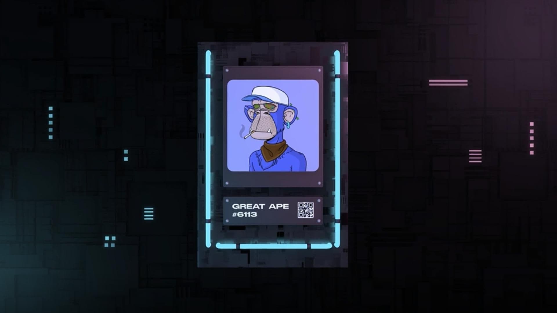
Creating NFT Cards with Tailwind CSS for Stunning Visuals
In this tutorial, we will take a closer look at an HTML code snippet that is the foundation for creating a visually stunning NFT (non-fungible token) card using Tailwind CSS.
Step 1: Open an HTML document
Begin by opening a new HTML document in your code editor. Copy and paste the following code snippet into the document:
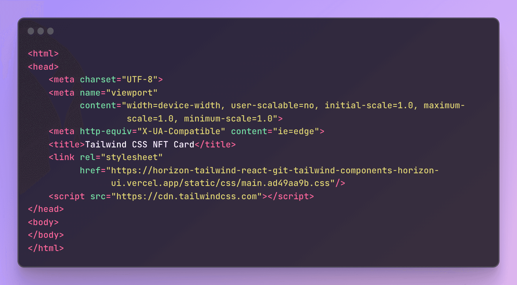
This code includes the basic HTML boilerplate and defines the structure and properties of your web page.
Step 2: Define the meta tags
The 'meta' tags included in the 'head' section of the code define the character set, viewport settings, and compatibility with Internet Explorer. These tags are essential for ensuring that your NFT card will look great on different devices and browsers.
Step 3: Set the title of the web page
The 'title' tag is included to set the title of your NFT card to "Tailwind CSS NFT Card". This is the text that will appear in the title bar of your web browser.
Step 4: Reference an external CSS stylesheet
The 'link' tag in the 'head' section of the code references an external CSS stylesheet that will be used to style the web page. This stylesheet is hosted on Vercel and will be used to style your NFT card.
Step 5: Reference the Tailwind CSS library
The 'script' tag in the 'head' section of the code references the Tailwind CSS library. Tailwind CSS is a utility-first CSS framework that makes it easy to design responsive and customizable user interfaces.
Congratulations! You have now created the foundation for a visually stunning NFT card using Tailwind CSS. With this HTML code snippet as your starting point, you can focus on designing a unique and eye-catching NFT card that collectors and investors will love.
Then we will break down a HTML code snippet that is used to create a responsive and visually appealing container for an NFT card.
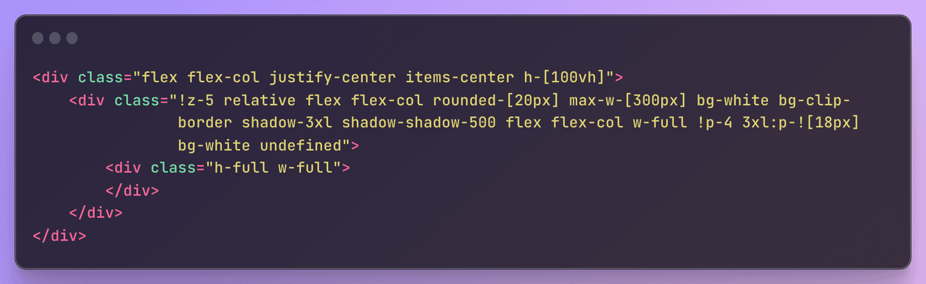
Step 1: Define the container
Begin by creating a container div with a class of "flex flex-col justify-center items-center h-[100vh]". This container will be used to center the NFT card on the page and make it responsive to different screen sizes.
Step 2: Create the NFT card element
Inside the container div, create a nested div with a class of "!z-5 relative flex flex-col rounded-[20px] max-w-[300px] bg-white bg-clip-border shadow-3xl shadow-shadow-500 flex flex-col w-full !p-4 3xl:p-![18px] bg-white undefined". This div will serve as the main element for the NFT card and will be styled with Tailwind CSS classes to create a visually appealing design.
Step 3: Add content to the NFT card
Inside the NFT card div, you can add any content that you would like to include in your NFT card. This can include images, text, and other elements that you want to use to showcase your unique NFT creation.
Step 4: Close the divs
Finally, close both divs to ensure that your code is properly structured and formatted.
Congratulations! You have now created a responsive and visually appealing container for your NFT card using HTML and Tailwind CSS. You can use this code snippet as a starting point for designing your own unique NFT cards that will capture the attention of collectors and investors alike.
Now that we have created a container for our NFT card in the previous step, we will now add an image and a button to it using HTML and Tailwind CSS.
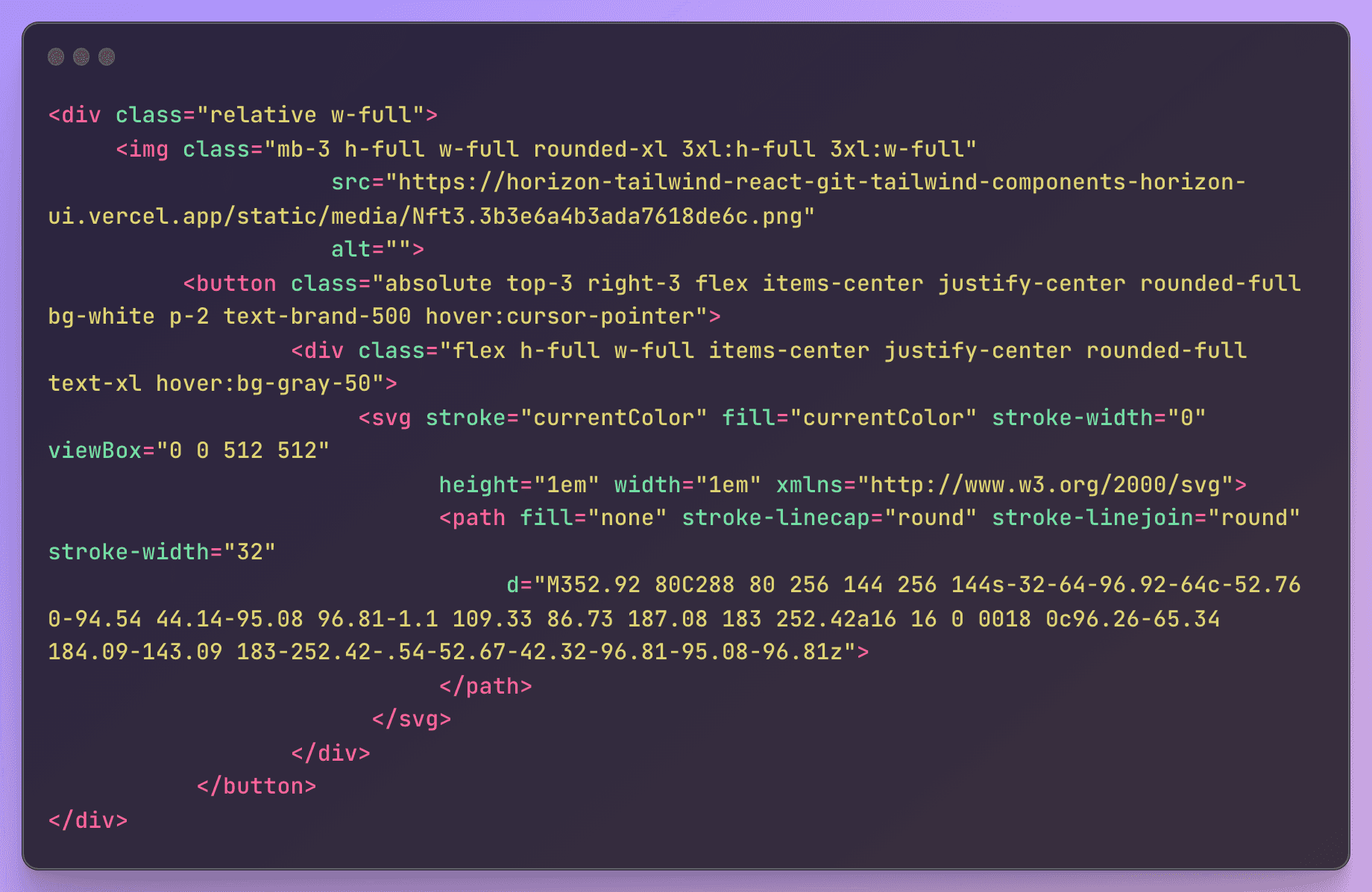
Step 1: Create a container for the image and button
Begin by creating a nested div inside the NFT card div with a class of "relative w-full". This will create a relative position for the elements inside this div and allow us to position the button on top of the image.
Step 2: Add the NFT card image
Inside the nested div, create an img element with a class of "mb-3 h-full w-full rounded-xl 3xl:h-full 3xl:w-full". This will display the NFT card image and set its height and width to take up the full size of the container.
Step 3: Create the button
Inside the nested div, create a button element with a class of "absolute top-3 right-3 flex items-center justify-center rounded-full bg-white p-2 text-brand-500 hover:cursor-pointer". This will position the button in the top-right corner of the container and style it with a round shape, white background, and blue text color.
Step 4: Add icon to the button
Inside the button, create a nested div with a class of "flex h-full w-full items-center justify-center rounded-full text-xl hover:bg-gray-50". This will create a circle shape for the button icon and style it with a gray background on hover.
Step 5: Add SVG icon to the nested div
Inside the nested div, create an SVG element with a stroke of "currentColor", fill of "currentColor", and a viewBox of "0 0 512 512". This will ensure that the icon color matches the blue text color of the button.
Step 6: Add path to the SVG icon
Inside the SVG element, create a path element with a fill of "none", stroke-linecap of "round", stroke-linejoin of "round", stroke-width of "32", and a d attribute to define the path of the icon.
Congratulations! You have now added an image and button to your NFT card using HTML and Tailwind CSS. This code snippet can be customized with your own image and button icon to create a unique and visually appealing NFT card for your collection.
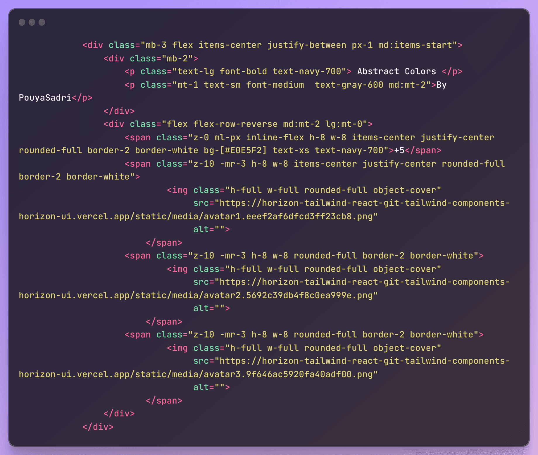
In this HTML code, we have a section that displays information about the creator of a piece of content, including their name and a small avatar image. This section is designed to be compact and visually appealing, with elements arranged in a way that maximizes space while still providing all necessary information.
The code begins with a container div that has some padding and aligns its child elements to the center. Within this container, we have another div that sets the layout for the main content. This div is styled with some margin at the bottom and flexbox properties that position its child elements.
The first child element is a div that contains the title and author information. The title is displayed with a bold font and navy blue color, while the author's name is displayed in smaller text underneath. These elements are arranged in a column and spaced out with some margin.
The second child element is a container div that holds three avatar images. These images are displayed with a circular shape and a white border. They are positioned on the right side of the section and slightly overlapped, giving the impression of a stacked stack of images. The first image is displayed with a green background and a number that indicates the number of people who have liked the content. The other images are displayed with no background color and are simply stacked on top of each other.
To add this code to an HTML file, you can simply copy and paste it into the desired location within the HTML document. The code utilizes classes to apply specific styles to each element, so it is important to ensure that the corresponding CSS styles are properly linked in the document.
Overall, this code provides a useful and visually appealing way to display information about content creators, and it can be easily customized to fit the style and layout of any web page.
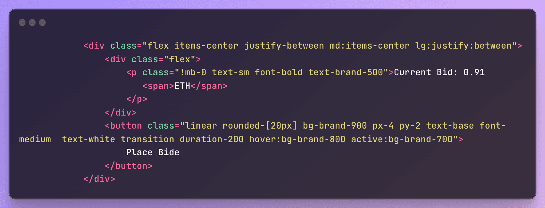
- The outermost container element is a <div> element with the classes "flex", "items-center", "justify-between", "md:items-center", and "lg:justify-between". These classes are used to style the container as a flex container that aligns its child elements to the center horizontally and vertically, and justifies the space between its child elements to either side of the container on larger screens.
- Inside the container, there is another <div> element with the class "flex". This element is also styled as a flex container.
- Inside this flex container, there is a <p> element with the classes "!mb-0", "text-sm", "font-bold", and "text-brand-500". The "!mb-0" class is used to remove any margin-bottom, while the other classes are used to style the text inside the <p> element with a smaller font size, a bold font weight, and a brand color. The text inside the <p> element reads "Current Bid: 0.91 ETH", and there is a nested <span> element that contains the text "ETH".
- Finally, there is a <button> element styled with the classes "linear", "rounded-[20px]", "bg-brand-900", "px-4", "py-2", "text-base", "font-medium", "text-white", "transition", "duration-200", "hover:bg-brand-800", and "active:bg-brand-700". These classes are used to style the button with a rounded corner, a linear gradient background color, and white text. The button reads "Place Bid". When the user hovers over the button, its background color transitions to a darker shade of the same color, and when the user clicks on the button, its background color transitions to an even darker shade of the same color.
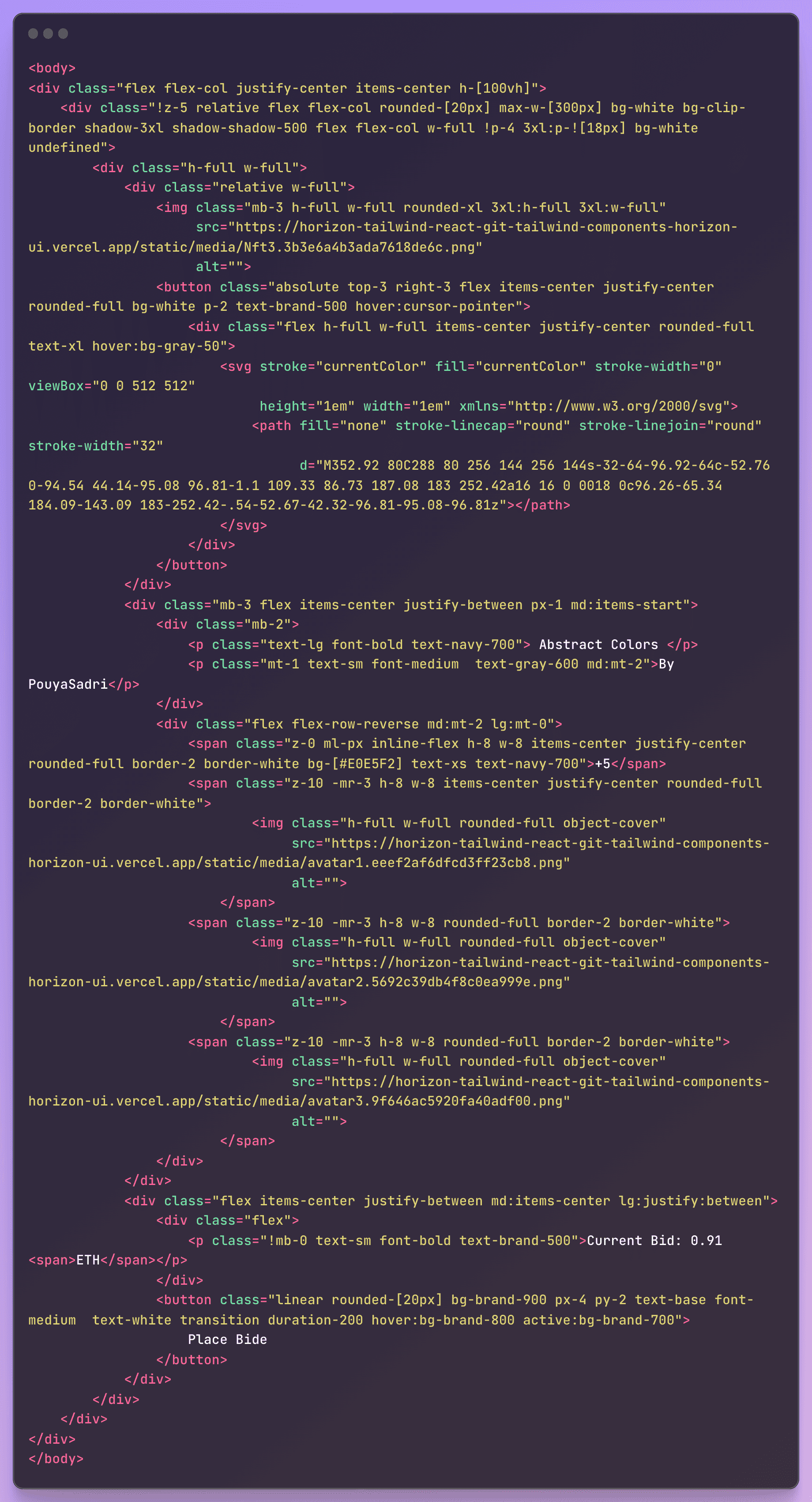
Here is the full code should be look like
In conclusion, creating a website is an exciting and rewarding experience that allows you to showcase your creativity and technical skills. With the right tools and resources, anyone can build a website that looks great and functions well. From designing the layout and choosing the color scheme to coding the functionality and optimizing for search engines, building a website requires a lot of hard work and attention to detail. However, the end result is worth the effort, as a well-designed website can help you promote your brand, connect with your audience, and achieve your business goals. So if you're thinking about building a website, go for it! You never know what kind of success and opportunities it might bring.
Looking for a professional and modern web design for your freelancing website? Look no further than our expertly crafted and SEO-optimized design solutions tailored specifically to meet the needs of freelancers and their clients.