Maximizing Your E-commerce Sales with a Killer Shopping Cart Page - A Tailwind CSS and HTML 2023 Tutorial
April 12, 2023
PouyaSadri
Learn how to create a stunning shopping cart page for your e-commerce website using Tailwind CSS and HTML. With our step-by-step tutorial, you can boost your online sales and create a better user experience for your customers. From customizing your shopping cart design to optimizing your checkout process, we've got you covered. Discover the power of Tailwind CSS and take your e-commerce game to the next level!
Tips
Tutorial
Tailwind CSS
HTML
As an e-commerce business owner, having a well-designed and functional shopping cart page is crucial to the success of your online store. In this tutorial, we'll walk you through how to create a visually appealing and functional shopping cart page using Tailwind CSS and HTML 2023.
Let's get started!
In just 15 minutes, you'll learn how to build a beautiful and responsive shopping cart page using HTML and Tailwind CSS - the ultimate combo for quick and easy web design. With Tailwind's powerful class system and pre-built components, you'll be able to create a cart page that looks and feels amazing without breaking a sweat.
Step 1:basic structure and metadata
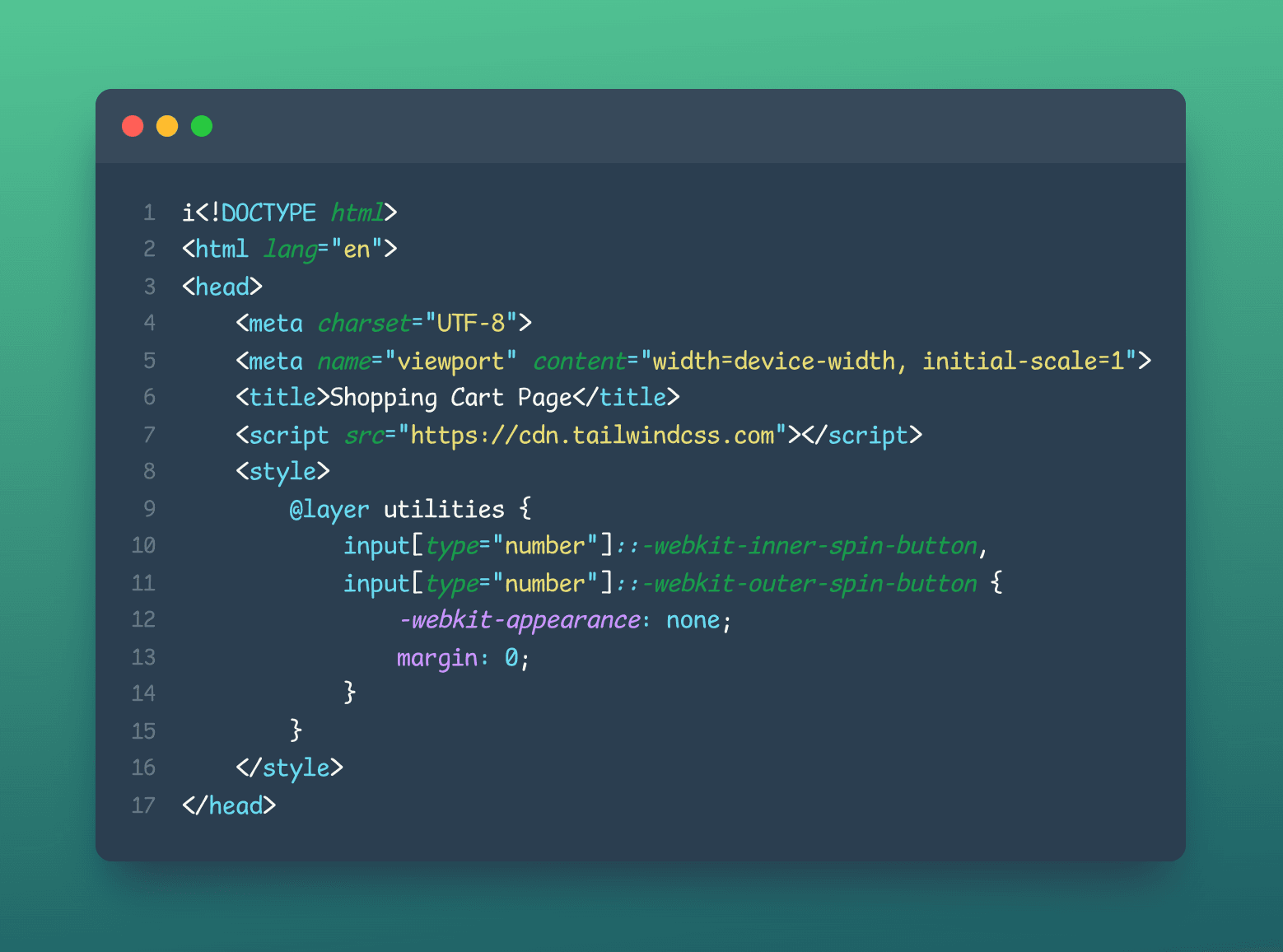
The first part of your HTML code sets up the basic structure and metadata of your web page. It declares the document type and language, specifies the character encoding, and includes metadata about the page such as the title and viewport settings. The viewport setting is important because it determines how the web page will be displayed on different devices. Finally, the code includes a script tag that links to the Tailwind CSS library and some CSS code that removes the spinner from number inputs.
Step 2:body element
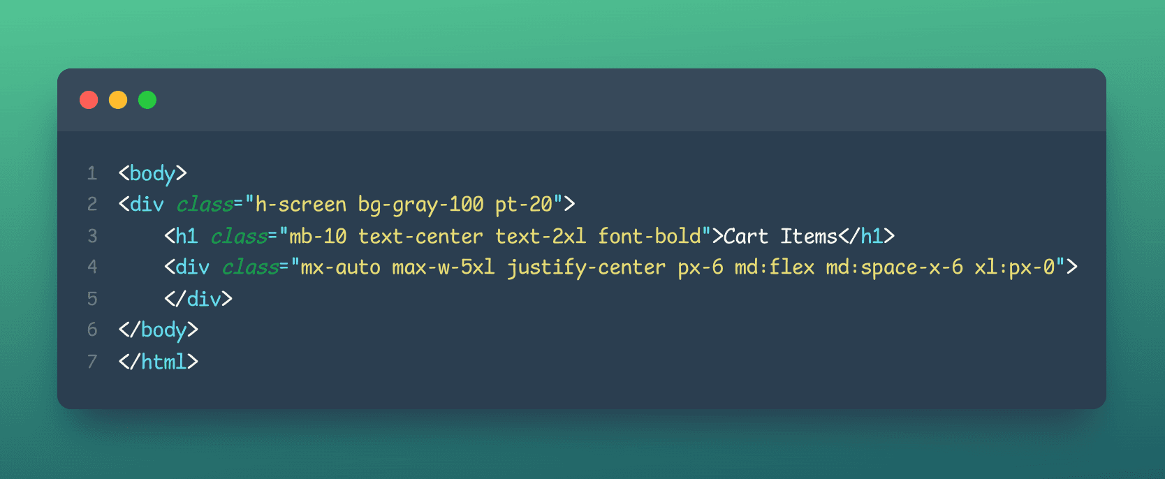
The first 'div' element contains a number of classes: 'h-screen', 'bg-gray-100', and 'pt-20'. These classes are defined in the Tailwind CSS library and are used to style the element. 'h-screen' sets the height of the element to the height of the screen, 'bg-gray-100' sets the background color to a light gray, and 'pt-20' adds a 20 pixel padding to the top of the element.
The h1 element is used to create a heading with the text "Cart Items". It has a number of classes as well: 'mb-10', 'text-center', 'text-2xl', and 'font-bold'. These classes control the margin, text alignment, font size, and font weight of the heading.
The second div element has a number of classes as well: 'mx-auto', 'max-w-5xl', 'justify-center', 'px-6', 'md:flex', 'md:space-x-6', and 'xl:px-0'. These classes are used to style the element and its child elements. 'mx-auto' centers the element horizontally, 'max-w-5xl' sets the maximum width of the element to 5 times the default width, 'justify-center' centers the child elements of the div, 'px-6' adds a 6 pixel padding to the left and right of the div, 'md:flex' sets the display of the div to flex on medium-sized screens and larger, 'md:space-x-6' adds a 6 pixel space between child elements of the div on medium-sized screens and larger, and 'xl:px-0' removes the padding on extra-large screens.
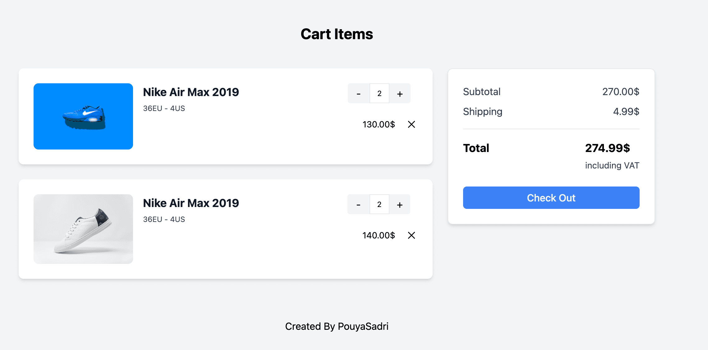
Step 3:defines the layout of a shopping cart page:
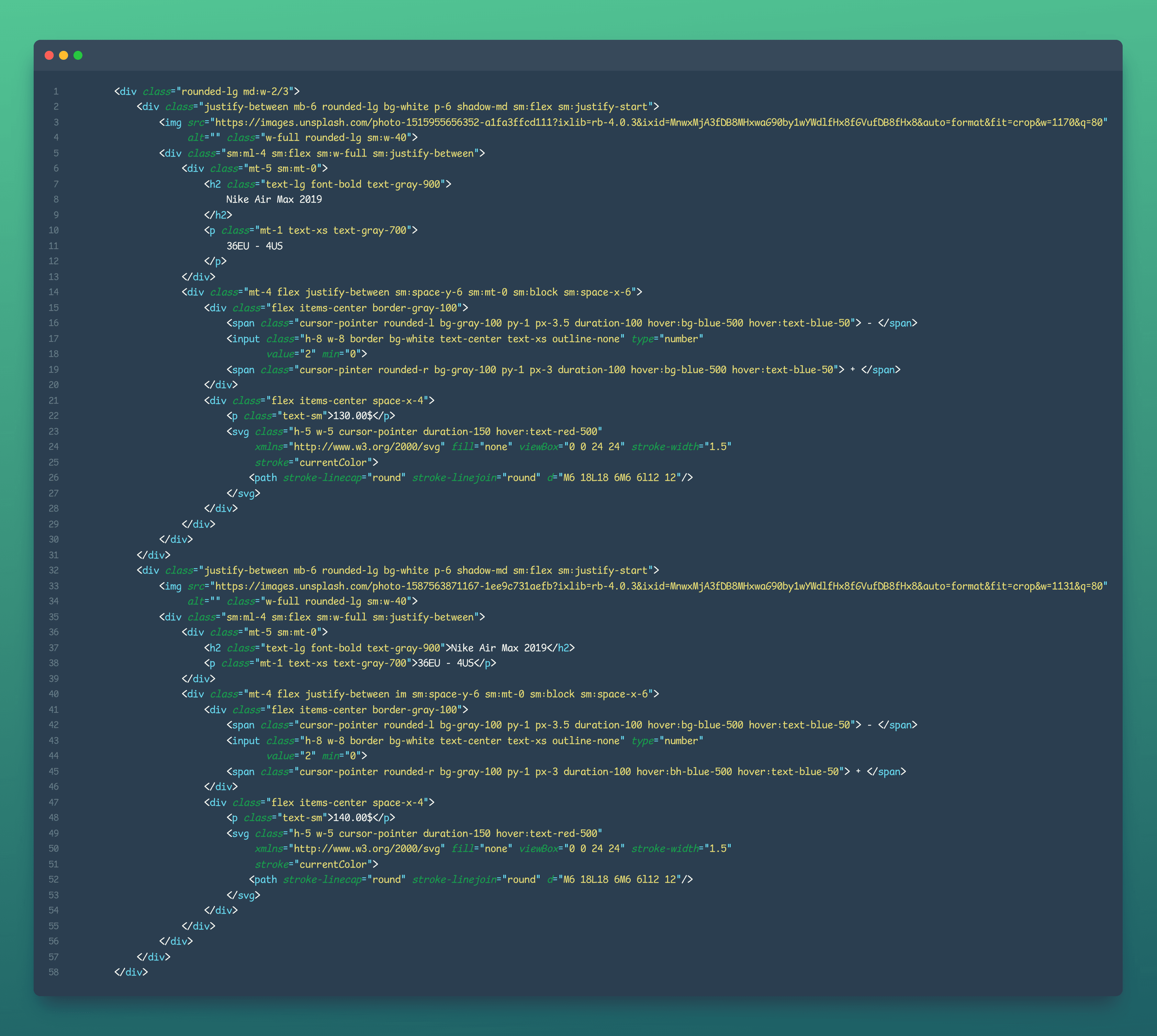
- The outermost div has the class 'rounded-lg' and 'md:w-2/3', which sets the width to two-thirds of the screen on medium-sized displays and rounds the corners of the div.
- Inside the outermost div, there are two inner divs with the classes 'justify-between', 'mb-6', 'rounded-lg', 'bg-white', 'p-6', and 'shadow-md', which create a card-like container for each item in the cart.
- Each card container contains an image, which is defined using the img tag and the src attribute to specify the image URL, and the alt attribute to provide alternative text for screen readers.
- The card containers also have an inner div with the classes 'sm:ml-4', 'sm:flex', 'sm:w-full', and 'sm:justify-between', which creates a flex container for the item name, size, and quantity selector.
- The item name and size are displayed using the h2 and p tags, respectively.
- The quantity selector is implemented using an input element with the type attribute set to number, and a pair of span elements with the classes 'cursor-pointer', 'rounded-l' and 'rounded-r', which act as the decrement and increment buttons for the quantity selector.
- The price is displayed using a p element with the class 'text-sm', and the delete button is implemented using an SVG element with the classes 'h-5', 'w-5', 'cursor-pointer', and 'duration-150'.
Step 4:creates a checkout section
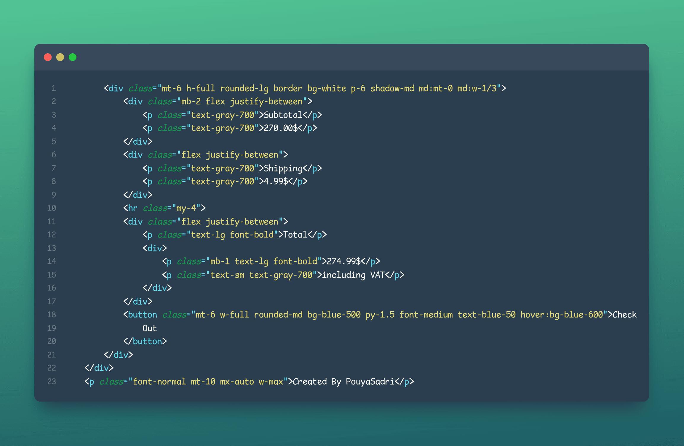
- A container div with a white background, border, and shadow. It has a width of 1/3 of the available space on larger screens.
- Two sections inside the container div, each containing a label and a value: "Subtotal" with the value "270.00$", and "Shipping" with the value "4.99$".
- A horizontal line element (hr) to visually separate the sections.
- A total section, containing the label "Total", the value "274.99$", and a smaller text indicating that VAT is included.
- A button labeled "Check Out" with a blue background color that becomes darker when hovered over.
- A small text element outside of the container div with the text "Created By PouyaSadri".
Final result: