How to Create a Floating Button with Tailwind CSS in 7 Minutes: A Step-by-Step Tutorial for Beginners
April 18, 2023
PouyaSadri
Learn how to add a floating button to your website using Tailwind CSS in just 7 minutes! In this step-by-step tutorial, we'll walk you through the process of creating a stylish and functional button that stays fixed on the screen as users scroll down. Whether you're a beginner or an experienced web developer, this tutorial is perfect for anyone who wants to enhance their website's user experience.
Tips
Tailwind CSS
HTML
Tutorial
Have you ever visited a website and noticed a small button that stays fixed on the screen, even as you scroll down? This button, known as a floating button, can be a great way to draw attention to important calls-to-action, such as "Sign Up" or "Contact Us". If you're looking to add a floating button to your website, you're in luck! In this tutorial, we'll show you how to create a floating button using Tailwind CSS, a popular utility-first CSS framework. In just 7 minutes, you'll have a stylish and functional button that can help improve your website's user experience. So, let's get started!
Don't forget to check out the accompanying YouTube video on my channel, where you can follow along with a visual demonstration of the steps outlined in this tutorial.
Step 1: Create the HTML file
The first step in creating a floating button with Tailwind CSS is to create an HTML file where we will write our code. To do this, open a text editor and copy the following code:
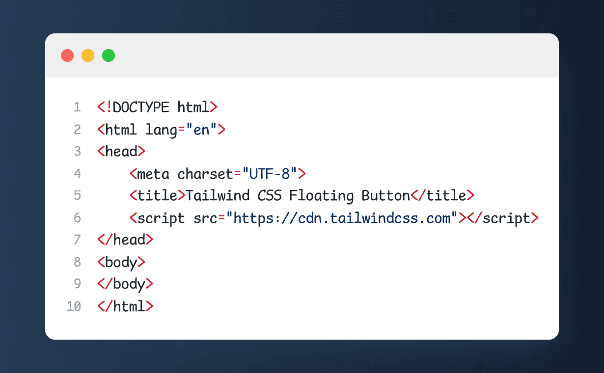
This code sets up the basic structure of our HTML file and includes the necessary links to Tailwind CSS and the Material Design Icons library. Make sure to save this file with a .html extension, such as index.html.
Step 2: Add the Floating Button HTML Code
Now that we have created the basic HTML file, we can add the code for the floating button. In the body of the HTML file, add the following code:
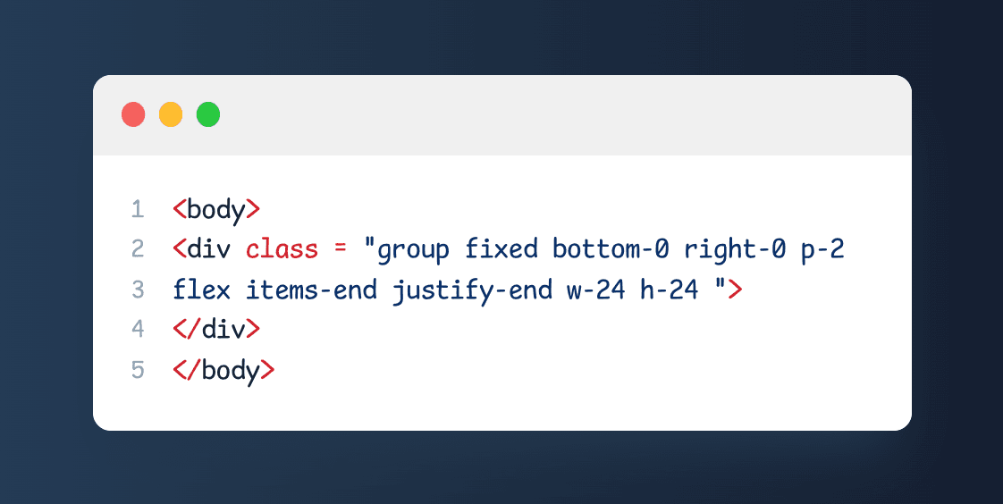
This code creates a <div> element with a class of "group", which is used to apply some hover styles to the element later on. The "fixed" class sets the position of the element to fixed, which means it will stay in the same place on the screen even when the user scrolls. The "bottom-0" and "right-0" classes set the element's position to the bottom-right corner of the screen. The "p-2" class adds some padding to the element, and the "flex" class makes it a flex container. The "items-end" and "justify-end" classes align the content of the element to the bottom-right corner. Finally, the "w-24" and "h-24" classes set the width and height of the element to 24 pixels, respectively.
Save the HTML file and open it in your web browser to see the floating button in action. It won't do anything just yet, but we'll add some styles and functionality to it in the next steps.
Step 3: Creating the floating button itself
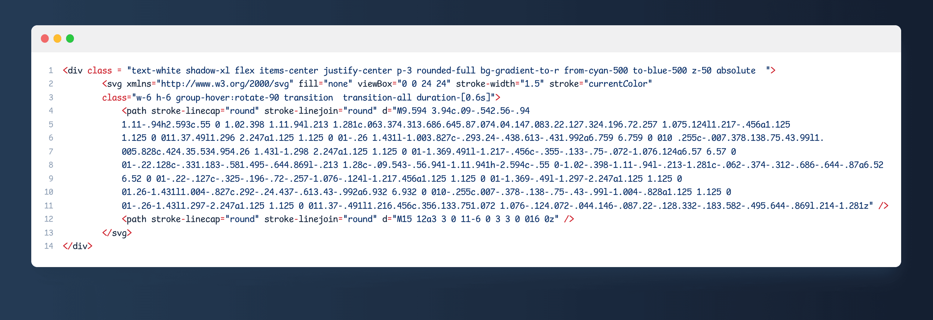
The third step involves creating the floating button itself. The button is represented by a div element with the class "text-white shadow-xl flex items-center justify-center p-3 rounded-full bg-gradient-to-r from-cyan-500 to-blue-500 z-50 absolute". Within this div, an SVG icon is used to represent the button. The SVG element has a class "w-6 h-6 group-hover:rotate-90 transition transition-all duration-[0.6s]" and includes two path elements. One of the paths represents a chevron icon while the other represents a circle. Together, they create the appearance of a button.
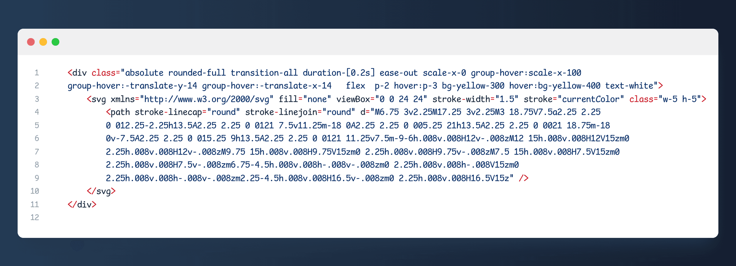
Step 4: create a green button with a plus sign icon on it.
This code creates a green button with a plus sign icon on it. It is defined as a <div> element with a class of "absolute" to position it independently of other elements, and "rounded-full" to give it a circular shape.
The button has a transition animation of 0.2 seconds, which applies a scaling transformation on the y-axis when hovered over by the user. Additionally, it has a hover effect that increases its padding, changes its background color to a lighter shade of green, and translates it 16 pixels to the left.
The contents of the <div> are an SVG icon, defined as a <svg> element. The icon has a stroke width of 1.5 and a stroke color of "currentColor", which is set to the current font color. The path of the icon is defined using two <path> elements, which draw the shape of a plus sign inside a box.
Overall, this code creates a simple button with an animated effect and an icon that could be used to trigger an action or display additional content on a website or blog post.
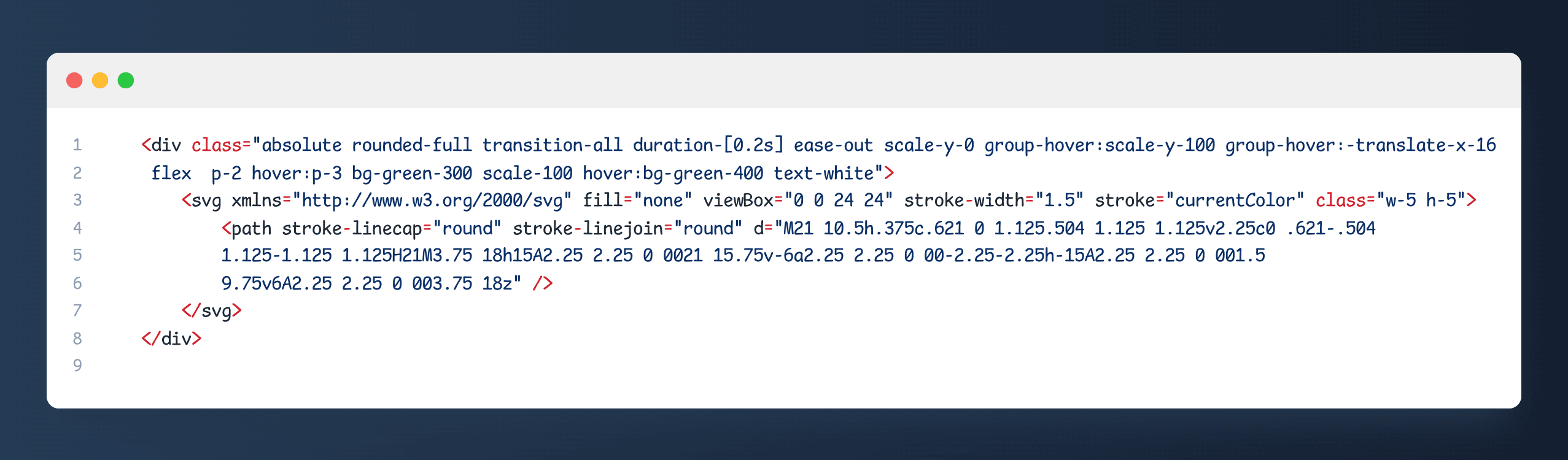
Step 5: Sub Top icon
The fifth step adds another <div> element with a different class name and an SVG icon. Here's the HTML code:
This <div> element also has the absolute positioning and the rounded-full class to make it a circle. It has a green background color with a light blue hover effect, achieved using the bg-blue-300 and hover:bg-blue-400 classes. It also has a transition-all effect with a duration of 0.2 seconds and an ease-out animation.
The scale-x-0 and group-hover:scale-x-100 classes are used to animate the element on hover, with the icon expanding horizontally. The group-hover:-translate-y-16 class moves the element up 16 pixels on hover.
The SVG icon itself is defined using the <svg> element, with the viewBox attribute defining the coordinate system and the stroke-width and stroke attributes setting the line width and color of the icon. The class attribute specifies the size of the icon.
The d attribute of the <path> element defines the shape of the icon, with a series of commands and coordinates. The icon appears to be a mix of various shapes, including lines and curves.
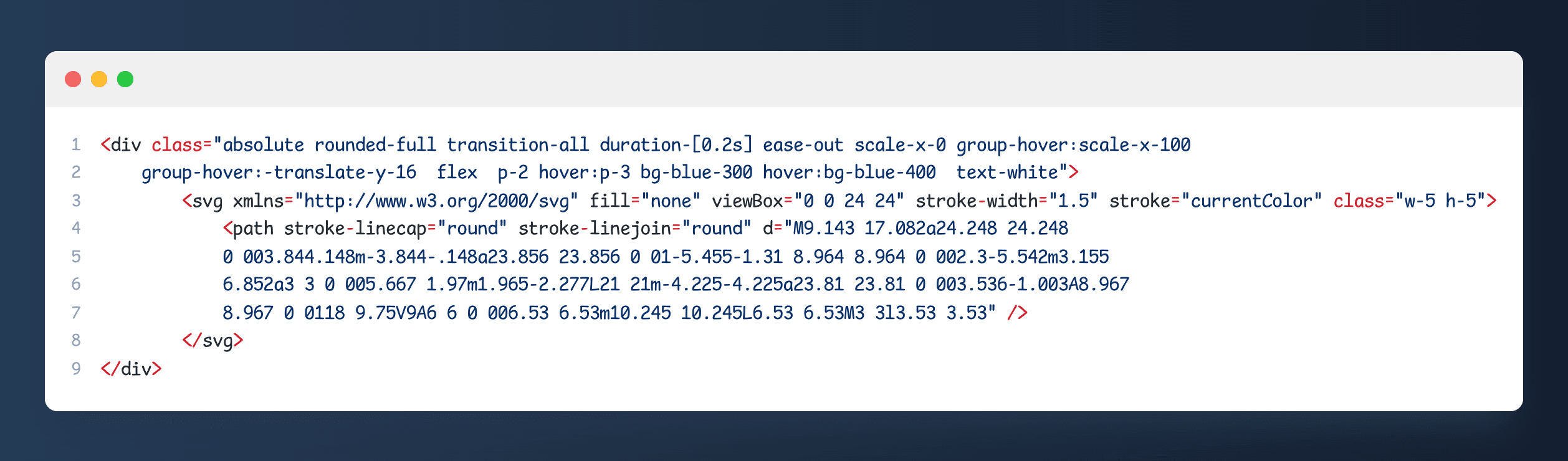
Step 6: Sub Middle icon
Step 6 involves creating a circular icon that appears when the user hovers over a specific section of the website. The HTML code uses a div element with a number of CSS classes that define the size, position, and appearance of the icon. The div element contains an SVG element with a specific path that defines the shape of the icon. The path has a stroke color, width, and style, and uses rounded line caps and joins for a smooth appearance. The SVG element has a width and height of 5 units, which is scaled up on hover using CSS transition and transform properties. The icon is colored with a yellow background and white text, which changes to a brighter shade of yellow on hover.
Final results :